Hello everyone, welcome back! I hope that you’re well.
As I write, we’re a year on from the first lockdown. Time has flown, yet somehow also dragged as we’re anxious to see family, friends and colleagues. Having taught adult art classes for more than twenty years, I have seen how art enhances lives as people seek – and find – solace from painting. I have very much missed interacting with fellow painters, and am looking forward to running classes and workshops again, being in the same room as other artists, and exchanging ideas, opinions and experiences.
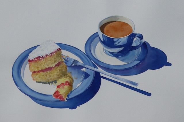
Having to stay at home has meant looking for inspiration there, instead of in the great outdoors. The view from my garden extends to the hilltop church and provides ever-changing skies, but I’ve looked indoors too, where I can find a surprisingly wide variety of subjects: Christmas baubles, ornaments caught in sunlight, a patterned window... A few late summer flowers that I gathered from the garden and photographed outdoors, in brief spells of bright sunlight, provided interest with strong cast shadows – material for several paintings. Tea and cake inspired another!
Lockdown Birthday
I rarely bake, and this cake, made when flour and eggs were in short supply, was an indulgence. Simple pleasures: jam made from homegrown raspberries and a sprinkle of coconut were added – for more interest in the painting, of course!
Sometimes inspiration seems just to appear. The words of Tim Minchin’s song, White Wine in the Sun, are about looking forward to family gatherings – a sentiment I’m sure we all share. The lyrics popped into my head as I sat enjoying the fading sun, idly noting the condensation on my glass – and couldn’t have been more perfect.
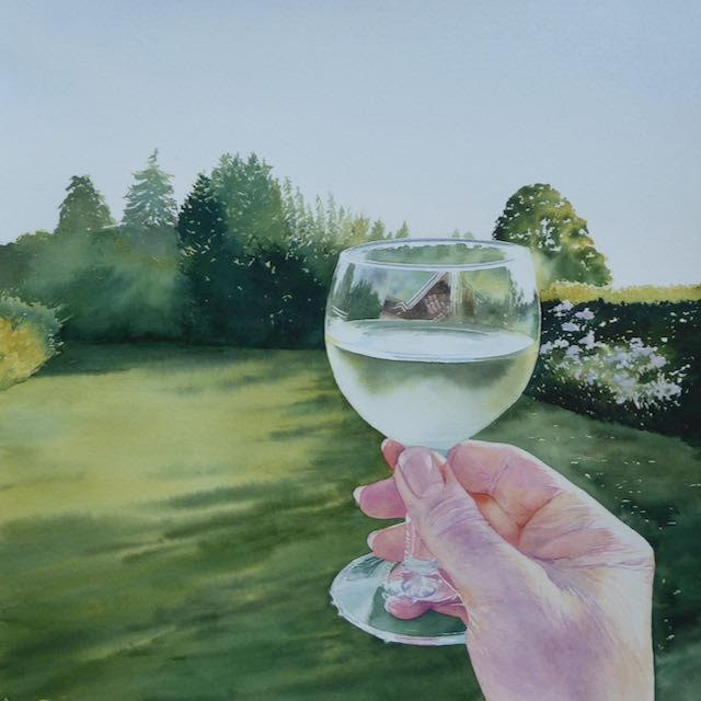
White wine in the sun
This painting wasn’t a planned piece; at this time of day the garden is mainly in shadow, and the air was beginning to chill, but I enjoyed painting it.
When considering a topic for this Virtual Festival,I considered ‘What if we can’t get out and about as hoped during May and June?’ Everyone has a window, a view of the sky, so that will be my topic. Lockdown or not, it’s good practice to paint the same scene many times, in different seasons and light: it’s never exactly the same twice. One sketch can provide material for numerous additional sketches and paintings.
When I began teaching I soon realised that many people struggle with painting, not necessarily due to lack of skill, but lack of observation, they don’t really look. Is the sky blue? If so, is it cobalt, cerulean, ultramarine, or something else? Is it all the same tone?
Study your views. They will differ according to the direction you are facing, the weather, and the time of day. To the east and west the sky is warmed, albeit fleetingly, by sunrise and sunset. Clouds may be illuminated from the front, side or back, and this makes a hue difference. Backlighting appeals to me, it provides silver linings.
A grey sky is rarely the same colour, tone and temperature throughout. Look harder: what do you see? Mist obscures but also reveals, as it falls between features of the landscape; see for yourself. Showers present lovely effects as clouds ‘leak’ rain or snow.
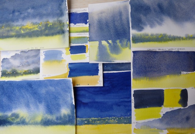
Here are a few examples of skies seen from my garden. The colour swatches and watercolour sketches are all made with my usual materials: Artists’ quality paint, a size 10 round brush (with a very good point) and Saunders Waterford High White paper. The sketches here are 18 x 12.5cm (7 x 5in) or smaller.
Blue Sky with Billowing Cloud and Shadows
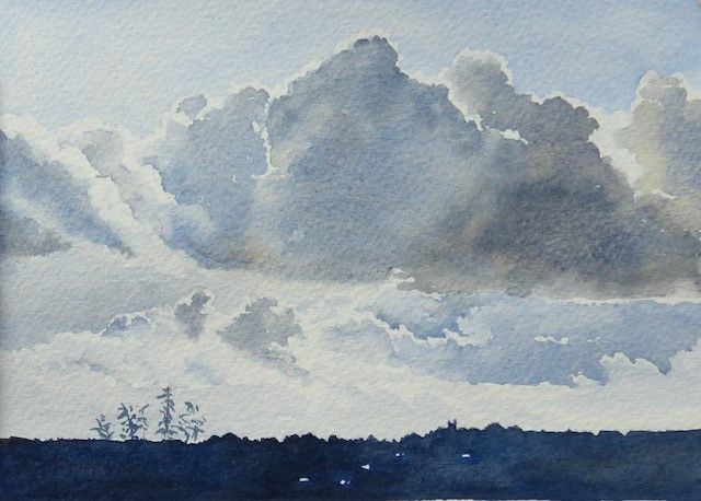
A late afternoon sky, looking south to the hilltop church. There’s plenty of light in the sky, giving an uplifting mood.
I painted the sky above the clouds with French ultramarine, using the lower edge of the wash to shape the white cloud below; I worked quickly, keeping the wash wet. The sky was not a flat blue, so I dotted in some stronger colour once the required area was covered.
I prepared some French ultramarine and burnt umber – a little of each on either side of my palette so that I could take colour from whichever I needed – and mixed a greyish colour in the centre of the palette, while keeping some variation in the mix. I quickly painted the shadow areas of the clouds, starting with the larger, darker areas and working out to the paler areas. I left unpainted paper for my whites, and space to soften the edges. I added water and more blue paint as I worked towards the left. I softened the edges here and there by running a clean damp brush along the edge of a damp wash. This slightly dilutes the colour at the edge of the wash, thereby softening it.
I painted the sky below the cloud, beginning on the right again and moving quickly, leaving white areas unpainted. I varied the colour and tone as I developed the rest of the lower sky, again softening here and there. The area just above the horizon was painted with the palest blue, giving minimal tonal contrast with the white of the clouds.
I allowed the sketch to dry then painted the land with a stronger mix of the blue and brown, leaving a few slivers of paper unpainted where light reflected from solar panels on distant roofs.
Additional washes could be used to strengthen tones or adjust colour, but I often just make a written note on my sketch. If areas need lightening, colour can be lifted by dampening the paint, working at it gently with a brush and dabbing with paper towel to lift colour.
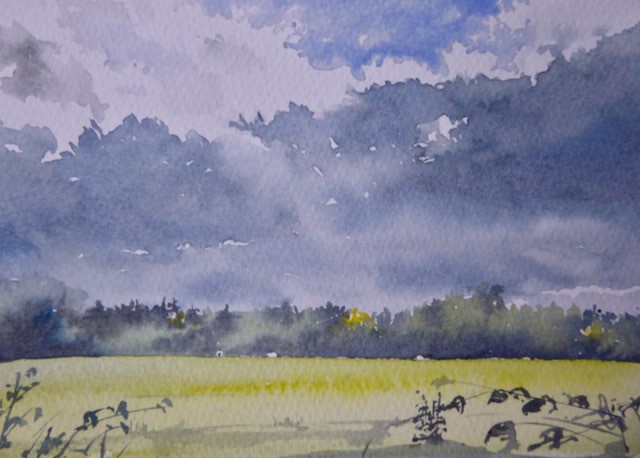
Stormy sky
Dark skies and sunlit grass or moorland appeal to me, as deep greys and blues work beautifully with golds and yellows. On this occasion I wanted the grass to be a slightly green-yellow; but the weather rapidly improved and my sketches were made from memory.
I intended to create a strong dark grey, but in exploring mixes, I became interested in the strength of colour seen in the centre image of the bottom row of these colour trials. This was a mix of Prussian blue and permanent rose. To this I added a little raw sienna to create a more neutral mix, which can be seen in the small rectangle above the previous image. I like the strength of colour in the blue and rose mix but my favourite French ultramarine and burnt umber mix (middle row far left) proved to be what I wanted, similar to this sketch inspired by a view close to home.
Sunrise
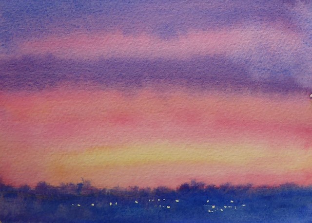
To fully appreciate a sunrise, I have to step outside, forcing me to take a breath of fresh air, and once outdoors I may well linger to enjoy bird song. This view, looking directly east, takes in another hill-top church.
Sunrises and sunsets vary enormously depending on what time they’re seen (how much ‘heat’ is in them, how much cloud there is and so forth). When you decide to paint one, look carefully. What do you see? Note what appeals to you. If possible, use your camera to capture the scene, although note that the subtlety of colours is often lost in a photograph. For this reason, it is important to make colour swatches on the spot to represent the colours you see.
The colours of this sunset proved challenging to replicate, they looked slightly unnatural seen with the naked eye, and reproduced poorly in a photograph. My colour trials indicated that a mix of permanent rose and scarlet lake over a dry wash of raw sienna would give me the unusual colour that I wanted.
My first wash started with a band of permanent rose and scarlet lake mix at the top, then a band of raw sienna, followed by more rose and scarlet above the horizon. Below this, to represent lighting on the land mass, I added raw sienna. When this wash was dry, I painted a second wash: raw sienna across the area that was to remain yellow, then bands of the permanent rose and scarlet lake mix, and a mix of French ultramarine and permanent rose. The French ultramarine and permanent rose mix was also used for the land, leaving tiny areas unpainted to indicate street lighting. I worked in this order to reduce brush washing/colour contamination.
These colours gave me a near match for the sky as I saw it. Achieving the correct colours doesn’t guarantee a good painting but I like to solve the puzzle of ‘how do I …?’. If it was a painting, rather than a sketch, I might make a third wash to strengthen the pinks and purples in the upper half of the sky, but, as it’s a sketch, I instead simply made a note on the back.
Sunset
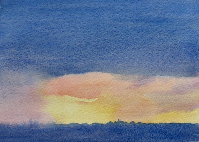
Here, the appeal was the combination of warm yellows and oranges with the blue. The first wash comprised a Winsor yellow and raw sienna mix applied to the lower centre, with French ultramarine above. When the wash dried I used Winsor yellow and raw sienna, with a little permanent rose added, around the central area to emphasize the window of yellow. Clean water added above the yellows prevented a hard line forming over the blue. I used French ultramarine for the land, adding this while the yellows were still damp.
I allowed this to dry and reviewed the result. I decided the sky was a little too blue – it needed a wash of French ultramarine and a little burnt umber, and the lower edge of this wash needed to be left hard in the centre. To the left, the wash was softened, allowing the impression of rain to continue. The horizon was sharpened with a little wet-on-dry detail.
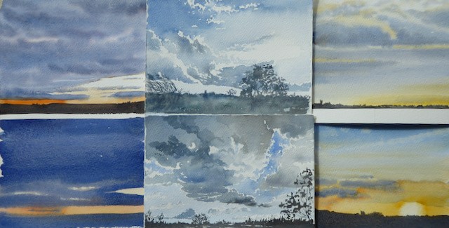
A few more sketches of sky views from the garden.
Over to you!
Take a glance at the sky around you, write down what you think you see. Look again – really looking – at the range of tones and colours, cloud shapes, and the nature of the edges. Are they soft or hard, and where? Whatever you see, you are, as a painter, at liberty to use artistic licence, but in taking a good look at what nature provides, you may get a little more than you expect from that ‘same old view from the window’.
Enjoy the summer, stay well. I look forward to seeing you soon.
Ready to Paint in 30 Minutes: Mountain Scenes in Watercolour is available from Search Press, RRP £12.99

Show us your spring crafts and you could be in with a chance of winning a £25 Search Press voucher!
To enter:
- Share a picture of your make or painting on Facebook, Twitter, Instagram or Pinterest
- Use the hashtag #SearchPressMakes and tag us @searchpress
- Tell us a little about the make and which book it's from
- If you don't have social media you can email a picture of your make to marketing@searchpress.com.
Every month we'll pick our favourite and the lucky winner will WIN a £25 Search Press gift voucher*.
Keep calm and craft on!
Follow us on:


#SearchPressMakes
Terms and conditions:
*Winner will be notified via social media or email and chosen entirely at Search Press’s discretion. Gift voucher may be exchanged for art and craft books available from Search Press Ltd. It cannot be exchanged for cash or replaced if lost. No change will be given but can be credited to your account to be used at a later date. Only redeemable at www.searchpress.com.